AR Mobile app

AR Mobile app

AR Mobile app

Spectral TMS: AR guidance in the daily tasks of industrial operators

Spectral TMS: AR guidance in the daily tasks of industrial operators

What does Spectral do?

Summary

Summary

Summary

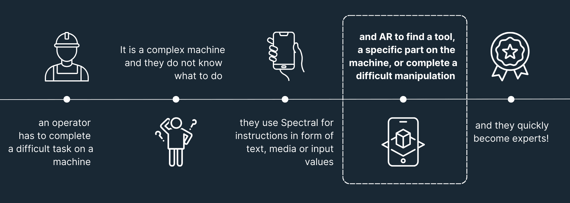
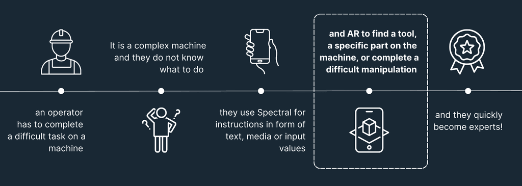
Spectral is an augmented reality solution for industrial operators that guides them through complex industrial tasks (operational modes). Initially, it had two products: Web Platforms and HoloLens App. We realised that HoloLens App was not used as expected and therefore, could prevent reaching long-term business goals. Thus, we decided to build a product that will be used by everyone.

Challenge

Build an accessible product to increase Spectral adoption rate and reach out to a bigger user base.

Reach a product market fit.

Process

Process

I lead all design initiatives, carried Discovery process, exploring major factories in Europe. I regularly worked with PM, developers, customer success and the leadership team.

Duration

Duration

January - April 2023

Role

Role

In a team of 6 developers, I was a UX/UI Designer & a UX Researcher

Impact

Engagement

We increased user engagement by 50 %

Expansion

We expanded user base by 35%

Opportunities

We discovered lots of future business opportunities

Impact

Engagement

We increased user engagement by 50 %

Expansion

We expanded user base by 35%

Happy users

We made life of our customers much easier!

Opportunities

We discovered lots of future business opportunities

What does Spectral do?

Research

Research

Research

Based upon the design sprint, we kicked off several workshops with the team to find out the scope of the project. We wanted to highlight the main pain points and jobs-to-be-done of our users. We also wanted to redefine our position on the market and which direction we would like to go.

Workshop insights

Research

UX Documentation

Jira Discovery

In order not to loose feedback and keep track, I set up Jira Discovery portal to capture all steps in the design process

FigJam

I used FigJam for brainstorming, competitive, SWOT analysis, for discovery process and communication.

Confluence

I used Confluence or Google Drive for more high level documentation for stakeholders and customers

What features to include?

Design

Design

Design

Design

What features to include?

Through collaboration with developers and product manager, we identified the core features of the workflow that would allow us to launch the app quickly, all while ensuring that it wouldn't compromise the quality and benefits for users.

I then identified primary, secondary, and tertiary parts of the flow and created a scheme which helped us better prioritise features. For the first iteration, we focused on the critical parts of the flow and postponed the implementation of the useful and delightful parts.

What features to include?

Design

Digital Twin

👨‍🚒 Industrial operators work in cognitively and physically overloaded environments. Thus, we designed the experience of finding a scenario as simple as possible.

🏭 We sticked to the existing organisational patterns they used to in the industry. The logic tree represents a Digital Twin - the structure of customer's factory. They can either search in the logic tree they are familiar with, or, search a scenario by name.

🪄Later, we developed a tag system that allows operators find a scenario faster. Since they may misspell a difficult tag name, we provided them a recommendation with similar tags.

Digital Twin

Design

Scenario page

To make the flow consistent, I divided content into Information, to read (text, different types of media) and Action, to interact (checkboxes). After multiple user testings, I found out about the necessity of Input Request feature and toggle buttons.

I made the AR button sticky and visible, so an operator could quickly switch to AR mode and guide themselves in the real world.

We wanted to prevent operators from returning back, or going to the step list, where they could skip multiple tasks. Therefore, I located these buttons on the very top, so user has slight difficulties reaching to them.

Scenario page

Design

Augmented reality

Augmented reality is still a pretty new topic, especially in the industrial sector. Users are not yet used to it. We wanted to design an easy and natural experience, so that users do not feel overwhelmed with complexity. This meant easing people into AR by increasing affordance, providing delightful cues and instructions throughout their experience in AR.

Delightful visual cues

When users encounter their first AR experiences, they’ll often forget they can move around. Thus, I designed delightful animated on-screen UI cues to encourage users looking around and moving towards objects in their work environment.

Moreover, these cues help users have a better experience since the AR tracking depends on the external physical factors (texture, lighting, etc).

Delightful visual cues

Augmented Reality

AR Guidance

Guidance in AR, especially in industry, can be tricky. There are a lot of nuances to consider, such as, spacial awareness, cognitive load, user safety and navigation or gesture linguistics.

Our goal was to guide operators towards objects in the real life, making their experience simple and following the ergonomic and safety rules.

I iterated on the solution by testing different options with real users. It was a challenging task, so I would like to showcase 2 iterations.

First iteration

At first, I wanted to show all elements at once.

An operator can see a bright yellow element on the screen - this is one of their targets. I used unnatural and flashy shapes and colours so users could quickly identify an element.

Bubbles show elements that are out of the view - they might be very close or far from the user. By clicking on the bubble, user can see what element is located out of the screen.

By clicking on "locate elements", bubbles are disabled and user can seen only an element that is located in the vision field.

Augmented reality

Augmented reality is still a pretty new topic, especially in the industrial sector. Users are not yet used to it. We wanted to design an easy and natural experience, so that users do not feel overwhelmed with complexity. This meant easing people into AR by increasing affordance, providing delightful cues and instructions throughout their experience in AR.

Delightful visual cues

When users encounter their first AR experiences, they’ll often forget they can move around. Thus, I designed delightful animated on-screen UI cues to encourage users looking around and moving towards objects in their work environment.

Moreover, these cues help users have a better experience since the AR tracking depends on the external physical factors (texture, lighting, etc).

Delightful Visual Cues

Augmented Reality

AR Guidance

Guidance in AR, especially in industry, can be tricky. There are a lot of nuances to consider, such as, spacial awareness, cognitive load, user safety and navigation or gesture linguistics.

Our goal was to guide operators towards objects in the real life, making their experience simple and following the ergonomic and safety rules.

I iterated on the solution by testing different options with real users. It was a challenging task, so I would like to showcase 2 iterations.

First iteration

At first, I wanted to show all elements at once.

An operator can see a bright yellow element on the screen - this is one of their targets. I used unnatural and flashy shapes and colours so users could quickly identify an element.

Bubbles show elements that are out of the view - they might be very close or far from the user. By clicking on the bubble, user can see what element is located out of the screen.

By clicking on "locate elements", bubbles are disabled and user can seen only an element that is located in the vision field.

AR Guidance: First iteration

Augmented Reality

After multiple usability testings, we found out that it might be not the best solution. Naturally, users move a device fast, so the bubbles would always be moving, constantly changing its values and position. This confused operators and evoked anxiety and cognitive overload.

Final design

A human brain tends to analyse one piece of information at a time.

Therefore, instead of bubbles, I designed a panel that displayed all elements listed in a certain step. An operator could select one element at a time, and be guided towards it.

When an element is selected, we simply show user where to look, using intuitive signifiers and visual cues.

If an element is in the vision field, but is more than 2 meters away, we indicate a distance and kindly remind them to be careful.

AR Guidance: Final Design

Design

Some more insights…

Balance

It is important to balance size and the amount of content on the screen. Lots of elements on the screen cover the real world and create a cognitive charge.

Environment

We adapted screens to different environments (e.g. pharmaceutics, where there is too much light) by adding a dark overlay layer, so the elements become visible.

Safety

Forgetting about real world can be dangerous. We kept users safe, reminding them to look around while walking and be cautions about their surroundings.

Also, we were biased at the beginning, assuming that older generation would not perceive AR positively and we were proven wrong. Older generation loves AR! AR for the win!

Results

Through the whole process of designing Spectral AR Mobile App, I was able to Discover the industry and people working there. It was a great journey of knowing and understanding industrial experts and problems they face.

By providing users simple onboarding, quick access to foundational features, and a simple AR experience, operators can now have an experience that allows them to be more empowered and productive.

Also, AR Mobile App gained a lot of trust among its customers and users. It has helped Spectral to reach its business goals:


Engagement

We increased user engagement by 50 %

Expansion

We expanded user base by 35%

Opportunities

We discovered lots of future business opportunities

Did you like the project?

Made with 💖 Iana Ivashkina, 2024

AR Guidance: Final design

Augmented Reality

Some more insights…

Balance

It is important to balance size and the amount of content on the screen. Lots of elements on the screen cover the real world and create a cognitive charge.

Environment

We adapted screens to different environments (e.g. pharmaceutics, where there is too much light) by adding a dark overlay layer, so the elements become visible.

Safety

Forgetting about real world can be dangerous. We kept users safe, reminding them to look around while walking and be cautions about their surroundings.

While interacting with AR, users tend to forget about the real world, which can be dangerous. Therefore, we tried to keep users safe, reminding them about their surroundings by various instructions. Ex: Remind them to look around while walking.

A human brain tends to analyse one piece of information at a time.


Therefore, instead of bubbles, I designed a panel that displayed all elements listed in a certain step. An operator could select one element at a time, and be guided towards it.

When an element is selected, we simply show user where to look, using intuitive signifiers and visual cues.

If an element is in the vision field, but is more than 2 meters away, we indicate a distance and kindly remind them to be careful.

Also, we were biased at the beginning, assuming that older generation would not perceive AR positively and we were proven wrong. Older generation loves AR! AR for the win!

Results

Through the whole process of designing Spectral AR Mobile App, I was able to Discover the industry and people working there. It was a great journey of knowing and understanding industrial experts and problems they face.

By providing users simple onboarding, quick access to foundational features, and a simple AR experience, operators can now have an experience that allows them to be more empowered and productive.

Also, AR Mobile App gained a lot of trust among its customers and users. It has helped Spectral to reach its business goals:


Engagement

We increased user engagement by 50 %

Expansion

We expanded user base by 35%

Opportunities

We discovered lots of future business opportunities

Did you like the project?

Made with 💖 Iana Ivashkina, 2024

Made with 💖 Iana Ivashkina, 2024

Scenario page

Design

Digital Twin

Design

Digital Twin

Design