Doula
Doula is a pregnancy app which provides guidance for pregnant women. It coaches women through contractions, helps them breath more calmly and relax. The Doula app also provides insights into the course of contractions using timer and two graphs.
Additionally, Doula allows the expectant mothers to log their symptoms and monitor changes throughout their pregnancy. The app is available for iOS and Android.
Challenge
The app is missing a symptom tracker that expectant mothers can use to log their symptoms and monitor changes throughout their pregnancy. Additionally, the visual style of the app is outdated and not very engaging. Users have also reported feeling disconnected from the app and are looking for a more personal and supportive experience.
January 2024
UX/UI Designer, Researcher
Heuristic evaluation of the old app.
Let's conduct a heuristic evaluation and analyse pros and cons of the existing app.

Observations
Soothing illustrations, helping women feel more connection with the app
Voice, Puff, Rest - useful features helping women breath and relax during the contractions
Contractions timer, actionable insights
Clear home screen with no distraction
Clear home screen with no distraction
The overall visual identity feels old-fashioned and not appealing
Unclear usage of main features on the home screen - which action helps with what
The side menu is hard to reach, not intuitive and messy
The data is visualised in a non-intuitive graph
Too much text
No personalised insights, except for graph that is used only during contractions
The app is used at the very end of pregnancy (~last week of pregnancy), due to its limited functionalities
Learnings
What could be kept
Home screen with no distraction (only main features - Voice, Puff, Rest)
Timer and contractions graph
What could be dropped
The visual identity
Unclear user flow
What could be added
Supportive messages from Doula, so the experience feels more personal and warm
Symptom tracker, so the user uses the app throughout their whole pregnancy
Easy and fast onboarding, for an easier usage
Research
I've interviewed more than 15 women and tried to understand:
- How they feel during pregnancy, what symptoms they experience
- Why do they need to track symptoms during pregnancy
- What is their experience with real-life Doulas and how the digital one can be helpful
- What would they like to see in such an app
Solution
Here is the updated look.

Let's dive deeper into details
Onboarding

As part of the onboarding, the user will be asked to select an expected date of labour, so Doula can calculate the user’s pregnancy timeline.
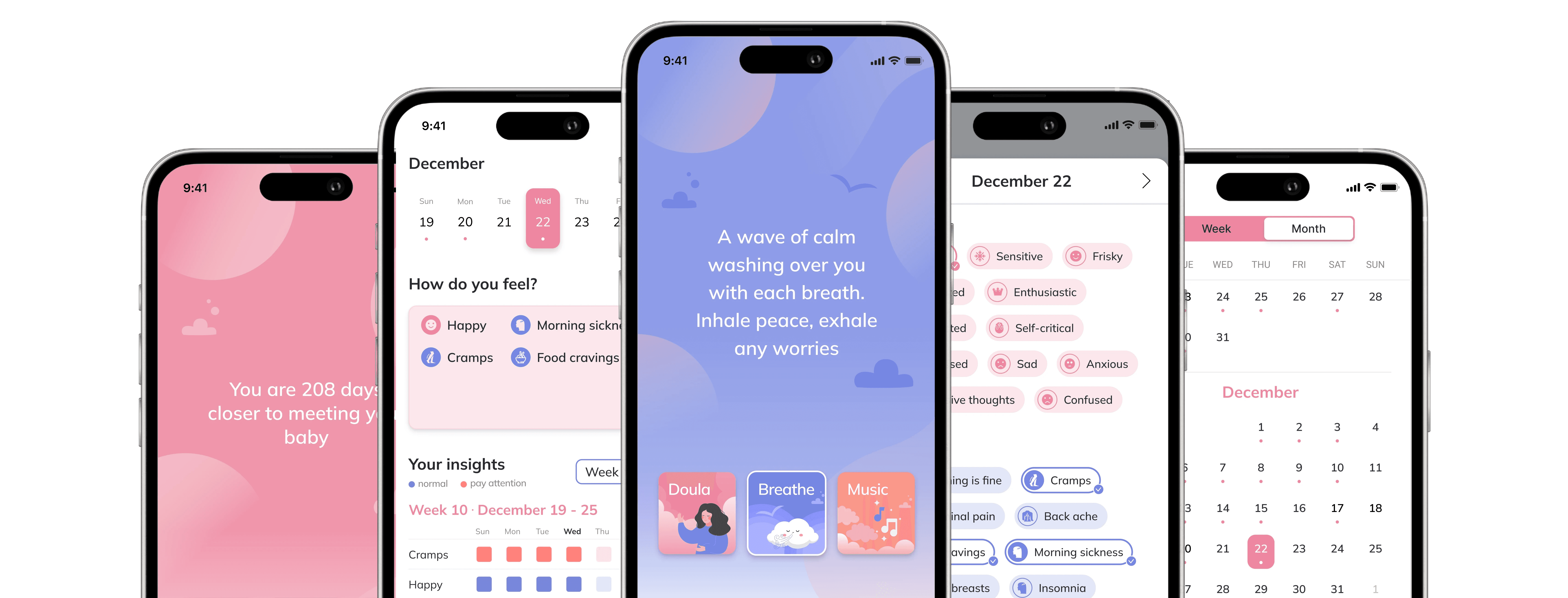
Home page
The Home page is in motion. The background shapes are slowly moving, imitating waves.
The user can toggle between the “Doula,” “Breathe,” and “Music” options. They can also access the “Graphs,” “Symptoms,” and “Settings” by clicking on the corresponding buttons.
Note: Doulas are very kind and supportive women. The way they talk to women is special - women feel relaxed and calm. Thus, I decided to display to the user these affirmations, so the user feels more supported.
Discover symptom tracker

To improve the discoverability of the symptom tracker, after user finishes their first coaching session, they will be asked to log their symptoms and will be redirected to the symptoms page.
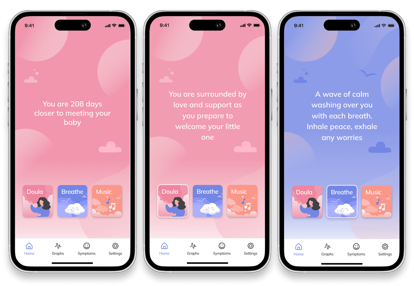
Symptom tracker
The goal of a symptom tracker is to help the user detect deviations or uncommon behaviour as early as possible. It is very important during pregnancy to observe the well being, since even small symptoms, like an allergy, can have a big impact on a baby. Thus, a deviation or a frequent repetition of a symptom is communicated through a colour coding.
The user can see their calendar, the day and the week of their pregnancy, their symptoms per day and analysis per week/month.
The user can log their symptoms by clicking on the button on the symptoms card. The symptoms are then displayed and are grouped by color.
Additionally, the user is able to view their weekly and monthly insights on the graph below. It displays the frequency of a certain symptom by week and by month.
Note: The insights are shown according to the frequency of each symptom. If the user feels cramps most of all, cramps will appear on the top.
It is important for the user to see the whole overview of what they feel during the pregnancy.
Therefore, the insights are shown in form of the complete graph, rather than a separate graph per one symptom.
The user is able to observe possible deviations and now it is clearly explained in the app.
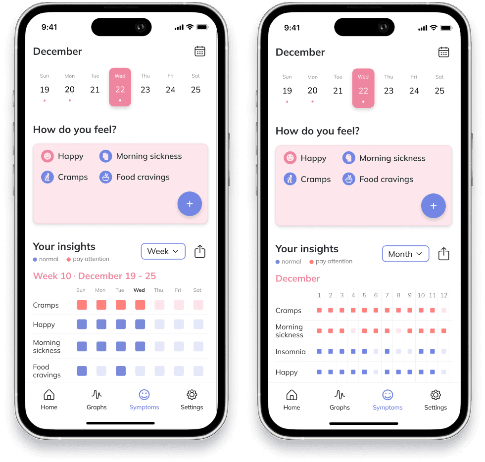
Symptoms
By clicking on “Log your symptoms” button, the user is directed to the symptoms list screen. Here, they will be able to choose their symptoms among the provided list.
The symptoms are grouped by “Mood’ and “Symptoms” categories.
This is the state when no symptoms are chosen.
If the “Everything is fine” option is selected, other symptoms in “Symptoms” category should be unselected.
Calendar

When the user selects the calendar icon in the top navigation bar, they will be directed to the calendar screen.
Here, they will be able to add symptoms for each day of their pregnancy and view their symptoms if they are already logged.
Empty states

This are the empty states when no symptoms or dates are logged and there are no insights to display.